To be more specific, if more than 50 percent of the population is dependent on government (employed in the bureaucracy, living off welfare, receiving pensions, etc), it becomes rather difficult to form a coalition to fix the mess. This may explain why Greek politicians have resisted significant reforms, even though the nation faces a fiscal death spiral.
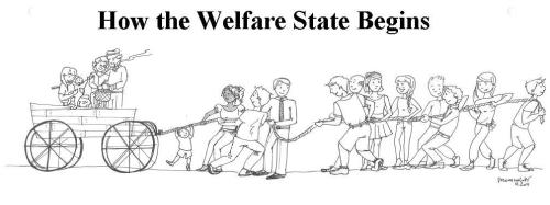
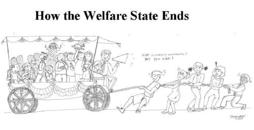
But you don’t need me to explain this relationship. One of our Cato interns, Silvia Morandotti, used her artistic skills to create two images (click pictures for better resolution) that show what a welfare state looks like when it first begins and what it eventually becomes.


These images are remarkably accurate. The welfare state starts with small programs targeted at a handful of genuinely needy people. But as politicians figure out the electoral benefits of expanding programs and people figure out the that they can let others work on their behalf, the ratio of producers to consumers begins to worsen.
Eventually, even though the moochers and looters should realize that it is not in their interest to over-burden the people pulling the wagon, the entire system breaks down.
Then things get really interesting. Small nations such as Greece can rely on permanent bailouts from bigger countries and the IMF, but sooner or later, as larger nations begin to go bankrupt, that approach won’t be feasible.
I often conclude my speeches by joking with the audience that it’s time to stock up on canned goods, bottled water, and ammo. Many people, I’m finding, don’t think that line very funny.


No comments:
Post a Comment